Patek Philippe Brought a Mixed Bag to Watches & Wonders
The Swiss watchmaker’s offerings at the world’s leading watch show had some highs and more than a few lows.
After Rolex, the biggest name in timepieces is Swiss royalty Patek Philippe; and, much like their colleagues, the esteemed watchmakers brought a mixed collection to Watches & Wonders, the giant annual show, where brands unveil their biggest releases for the year.

This year’s latest Nautilus comes with a new sky blue dial and denim-patterned calfskin strap. The goal here is to make the Nautilus more youth focused and sporty, but it doesn’t quite work. The complexity of this dial only works with simple colors that put the attention on the dial, and the bulky, somewhat awkwardly shaped case works best when visually balanced by a steel strap. Even so, the existing blue dial Nautilus looks better than this, and the brown-and-gold 5980R-001 remains the best chronograph version.

The same look was applied to the formal, underrated white gold World Time, but here, the light blue and denim-effect strap gives it a really beautiful look. With a simple round case but intricate, detailed dial, it’s a beautifully balanced design, with lovely subtle details like the red dot between Auckland and Midway to mark the International Date Line, and a red-tipped transparent glass hand for the date.

Patek Philippe Aquanaut Travel Time
The third light blue watch unveiled was an Aquanaut, with rubber strap, 6-o’clock subdial, and white font, clearly inspired by the Tiffany version that was such a viral hit but a few years ago, and had celebrities begging to get on waitlists. This is a far more pleasant color though, and tied with the World Time as the only great watches released. The Aquanaut has always been a perfectly balanced sports watch, and whereas a steel strap makes it more formal, and the popular green or orange rubber-strapped version lean heavily into the sporty side, this is right in the middle.

Patek Philippe Aquanaut Travel Time
By contrast, its gold-cased sibling at the show is exactly how not to do an Aquanaut. As with the previous watch, it has a hollow home-time hour hand, and its travel time is a lovely complication, but the single element of this is worse than the other colorway. The darker blue of the strap and dial is uglier. The use of contrasting white hour markers and hands with gold sleeves and font is garish; as is the contrast between the strap and the gold case. Even its smaller size is worse, as it makes the case look too bulky and the strap too cramped. It’s hard to make gold work on an Aquanaut and this is certainly not it.

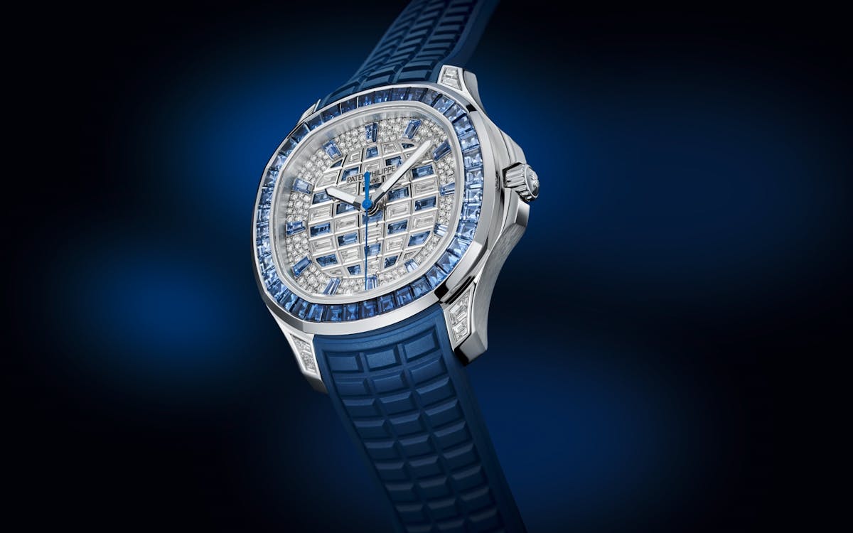
Patek Philippe Aquanaut Luce Haute Joaillerie
Even uglier though is the iced-down Aquanaut Luce Haute Joaillerie. With a blue sapphire and diamond check dial, alternating sapphire hour markers, blue rubber strap, and sapphire bezel, it seems designed to go with Pharrell’s new bejeweled Louis Vuitton Damier items, and I’m sure the tasteless rich who own those will love this.

Patek Philippe Annual Calendar with Moon Phase
The Annual Calendar with Moon Phase fits its name, as it’s a boring watch with complications thrown on top. It’s very uninteresting, but it’s not offensive, and comes in platinum with a salmon dial or white gold with a blue dial.

Patek Philippe Retrograde Perpetual Calendar Rare Handcrafts
The Retrograde Perpetual Calendar ‘Rare Handcrafts’ is also long-winded, but certainly not boring; though not in a good way. With a fussy dial, retro font, brown leather strap, gold round case, and intricate engraving, it will appeal to some, but feels to me like a bad impersonation of an antique clock. If you like that style, I would stick to those.

Patek Philippe Alarm Travel Time
The following three watches see Patek trying to get into other styles; though with similar mixed success. The first is the fabulously complicated Grand Complications Alarm Travel Time, which takes style tips from vintage army watches. I like this style, but it has been contemporaneously defined by budget brands like Hamilton and Farer, which you’d hate to have your very expensive Patek confused with.

Patek Philippe’s ‘Golden Ellipse’ has always been underrated in their rundown and should compete well with Cartier and their women’s range, which has become rather trendy even among men, courtesy of celebrities like Timothy Chalamet and Tyler the Creator, and this gold version, with a black curved dia,l is a nice addition.

Patek Philippe Twenty-4 Quartz
Finally, there’s the Twenty-4 Quartz, now offered in rose gold with a beautiful purple dial. It’s a classic women’s watch, which has always been a weakness in their range, and clearly intended to take on Cartier, and does so unremarkably. My view is that Patek should take this line slightly up-market and target it to men, slimming down the case, adding interesting mechanical complications, and making it the trendy, entry steel Patek. Clearly they disagree